
As web and app designers, the differences between responsive and adaptive web design approaches highlight important options. Choosing with insight can help you plan and execute your designs with more purpose, meaning, and effectiveness. Because of the pervasiveness and diversity of mobile devices, we as designers must accommodate a wide range of screen sizes. Every web and app designer is currently confronted with this problem.

There are numerous ways for users to access information online today, ranging from the large corporate monitor to the smartwatch. Designers who want to bridge the device gap have two options for their designs: adaptive sites or responsive sites.
What is Adaptive Design?
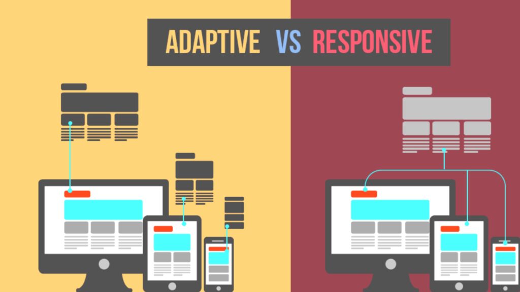
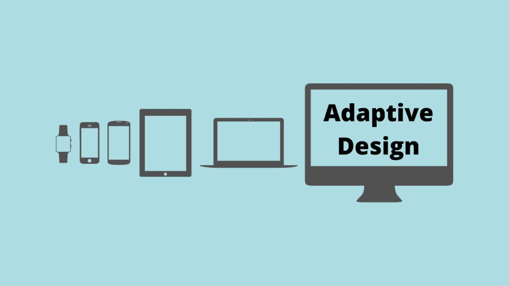
Adaptive design is a type of graphical user interface (GUI) that adjusts to various screen sizes. Designers use it in graphical user interfaces (GUIs), such as webpages, that must work on a variety of devices. Adaptive design typically employs multiple fixed layout sizes, with the system selecting the most appropriate layout for the screen when the browser size is detected.
Responsive design, which adapts to different screen sizes, is similar to adaptive design. The difference between adaptive and responsive design is that the content follows a fixed layout size in adaptive design, the content follows a fixed layout size, whereas, in responsive design, it moves adaptively. To put it another way, adaptive design starts with a few fixed layouts before deciding on the best one for the current screen size.
Responsive design, on the other hand, employs a single layout that resizes to fit the screen size. Designers in adaptive design are expected to create six designs for the six most common screen widths: 320, 480, 760, 960, 1200, and 1600 pixels. Adaptive design has the advantage of allowing the designer to tailor solutions so that the GUI looks great on a variety of screen sizes.
The disadvantage is that adaptive design is costly because it requires the designer to create up to six separate GUIs—or, in other words, the equivalent of six different versions of a single webpage—in toing order to have the best one ready to latch onto the screen specifications user requires. Another disadvantage of adaptive design is that users with non-standard-sized screens may be left without an optimal solution. Nonetheless, no designer should dismiss its utility because it is still one of the options for presenting output that would otherwise be unsuitable for another method.
Read more – How to Start WordPress Web Design and the Best Tools You Need to Know
Adaptive Design Literature
The Interaction Design Foundation has a list of articles about adaptive design. You might find some of them useful in your work.
Responsive vs. Adaptive Design
Dividing the difference between responsive and adaptive web design techniques enables us to see how we can idealize and make improvements to our web page or application layouts. Balancing our view with insight allows us to plan and execute our designs more effectively.
With the complexity and diversity of mobile devices, as web designers, we need to design websites for an assortment of screen settings. This is a challenge that web and app designers face today. Ranging from desktop monitors to smartwatches, there are various ways in which users can access information online nowadays. Web designers looking to bridge the technological gap between devices must adapt their design accordingly.
There may be confusion among a few people concerning the difference between responsive design and adaptive design. The boundaries may seem blurry to others not familiar with the topic, but there are clear distinctions if you look closely at the two.
Adaptable design
In his book, Responsive Web Design, Ethan Marcotte, a web designer, and developer, coined the term Responsive Design. As the browser width changes, getting it done adjust the placement of design elements to fit in the available space.
A responsive website adjusts the amount of content displayed based on the amount of browser space available. If you open a responsive site on a desktop and then change the size of the browser window, the content will adjust dynamically to fit the new window size (at least in theory). On mobile phones, this process is automated; the site checks for available space before presenting itself in the best possible configuration.
The concept of responsive design is simple. Because it is fluid, users can access your online world and enjoy as much of it on their handheld device as they can on a large monitor. True responsive design necessitates both a detailed conceptual model of the site and a thorough understanding of the end users’ needs and desires!
Web Design that Adapts
Adaptive design has multiple fixed layout sizes, whereas responsive design changes the design pattern to fit the real estate available. When the site detects free space, it chooses the most appropriate layout for the screen. As a result, when you open a browser on a desktop, the site selects the best layout for that screen size; resizing the browser does not affect the design.
Adaptive design has been quickly adopted by some websites. Amazon, USA Today, Apple, and About.com all set up their websites to be mobile-friendly. A mobile website with an adaptive design may have a different layout than the desktop version. This is because the designers chose a different layout for the phone’s screen rather than allowing the design to reorganize itself.
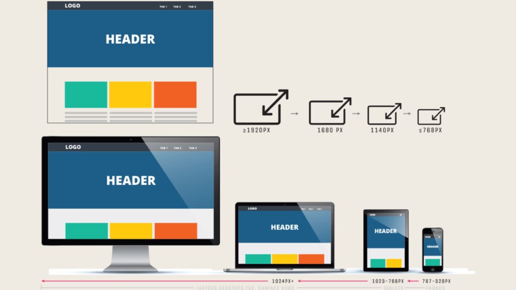
It’s standard practice in adaptive design to create six different designs for the six most common screen sizes: 320, 480, 760, 960, 1200, and 1600 pixels.
Short Story: The true story About CRYPTOCURRENCY
Design for Mobile Devices on Their Own
There’s also the option of creating a mobile-only website (denoted by the “m.” prefix in the URL bar of a browser). This strategy used to be a great one. Designers would create sites specifically for mobile devices, with elements and layouts tailored to the format. Mobile sites used to get higher search engine rankings from Google, but adaptive and responsive sites now get the same treatment.
The main disadvantage of creating a separate site (rather than using different designs or employing a changeable design) is that keeping the two versions of a website homogeneous requires a lot more maintenance. The mobile-only design has fallen out of favor in recent years due to a lack of determination. It does not appear to be making a comeback anytime soon.
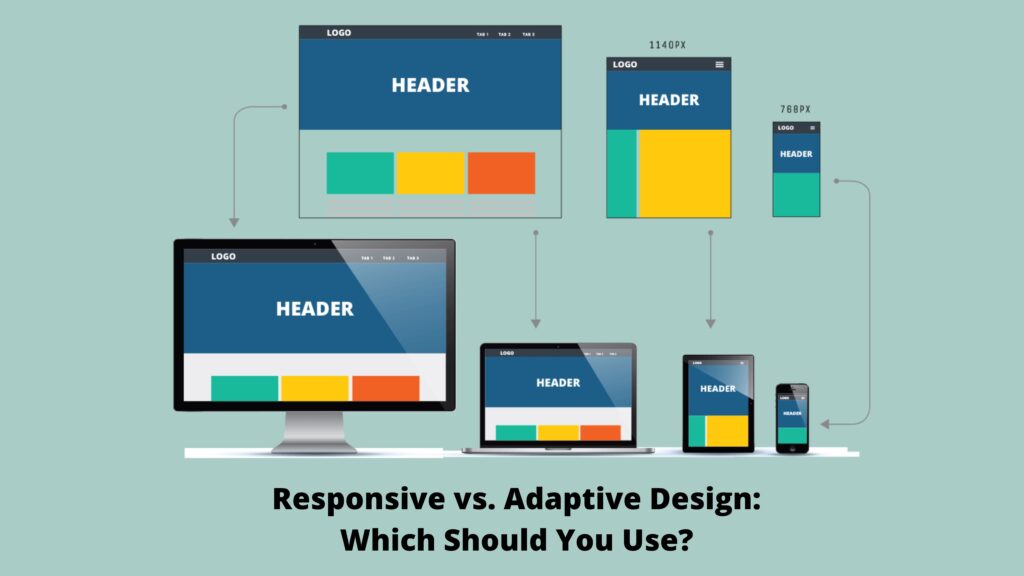
Responsive vs. Adaptive Design: Which Should You Use?
It is simpler and less time-consuming to implement responsive design. It gives you less control over your design on different screen sizes, but it’s currently the most popular way to build new websites. This could also be due to the abundance of low-cost templates available for most Content Management Systems (CMS), such as WordPress, Joomla, and others — after all, who wants to reinvent the wheel?
Sensitive designers create a single design for all screens, starting in the middle of the resolution scale and using media queries to determine what adjustments should be made for the low to high-resolution scales. This makes users happy because the familiar web design appears to be guaranteed to work on any device’s screen. In toorderder to provide a good user experience, uniformity and seamlessness are critical considerations.
In responsive design projects, it’s critical to keep an eye on the visual hierarchy; you’ll want to try to maintain it as your elements shuffle around the screen. That means a lot of testing on a variety of devices to make sure you’re on the right track. If a site’s design is simple, it will translate well across device screens, flowing from one container to the next like a liquid.
Another strong argument for using a responsive design is SEO. Responsive websites (those with a URL that works across all devices) are currently more search engine friendly. The responsive design seems to have a strong use case. Well, it might; however, bear the following in mind:
Read more – Best Review web Design software tools Ranking in 2022
Any promotions you’ve added may not fit into the space because your website will “flow” from device to device, adapting to the screen size. The “shortcut” provided by responsive design may now require some rethinking and work.
The time it takes for a file to download varies depending on whether you’re using a desktop or Image flexibility is a major consideration in this case. A large design that appears quickly on a large screen at home or work takes longer (and uses more data) to appear on your smartphone. For the mobile version, would a smaller preview be preferable?
Design that adapts
will (possibly) provide the best user experience regardless of which device the user is interacting with. Unlike responsive design, which allows a screen to “flow” from a desktop to a smaller device, the adaptive design allows for custom solutions. They adapt to the user’s situational needs and capabilities, as the name implies. By making our designs touch-friendly, we can demonstrate to users that we understand their needs on a mobile device. We can do the same for desktop users in the meantime.
We start with the lowest resolution version of the site and work our way up. The current standard is six designs, but depending on your users’ data, you may be able to use fewer. Adaptive design has the advantage of feeling more relevant to today’s user experience, whereas responsive design demonstrates a more desktop-centric approach (with the demands of other devices taking a secondary, almost passive place). With our smart devices, we are out and about more as users.
We like to think that our gadgets are paying attention to what we’re doing. Take a literal example: if you were driving through a long tunnel, wouldn’t you prefer a GPS screen that adjusts its brightness in response to the environment? Context-based performance and usability are reassuring, confirming that your smart device is capable of adapting and becoming even more useful.
You can also design your app’s screens for optimal positioning on/inNTAUR interface. Given that you are designing for various other resolutions (i.e., different viewpoints), it’s possible to understand latent user needs. The sophisticated sensor technology used in, say, a smartphone allows companies (and of us designers) to know more about the user than ever before. A frequent customer frequents a place, retail store, gym, etc., by checking in, he or she creates a profile. This (behavioral targeting, also known as personalization) allows personalized coupons to be designed.
A company that connects desktop and mobile users will often be ranked higher than a company with a responsive website due to its adaptive website. Statistical studies indicate that this can be a tremendous change of 2 to 3 seconds. Adaptive design has some strong advantages. However, in the game of designing for the best user experience and providing the best solutions, we must remember that we have to take the time to examine our options and the realities of our users.
The initial step to using the adaptive design is deciding on the subject matter. Compared to responsive design, text box, for example, an adaptive layout is usually a lot more work. Because of this, adaptive websites are employed primarily to update mobile-ready sites so that they may be used on computers as well.
Later, designers may neglect to include users in the middle if they only cater to users who are using desktops and laptops. Because of this, designers need to offer a hyperlink to make sure that users who only need smartphones and tablets can be shifted to the other version.
All else being equal, search engine robots are certainly getting better at distinguishing between your .com sites and m .com sites, so it’s wise to accept the status quo. Given that search engines still don’t rank similar content over multiple URLs equally, it’s advisable to adopt an adaptive design to reflect the present standard of search engine bots.
So you should t dismiss Adaptive Design when your budget permits it. Google’s simplicity of website loading and user preferences combine to create a requirement for responsive design.
Read more – What Is Web Design? A Comprehensive Guide.
Take-Away
Nowadays, having a selection of three options makes modern web design more flexible compared with those that focused solely on either Responsive Design or Standalone Design — those approaches are no longer used today.
Responsive design lets designers display content on an individual’s platform or tablet based on the content’s presence, which guarantees design uniformity even on smaller devices. Responsive design is the long-established standard and remains more popular.
Pros
Uniform & seamless = good UX.
The abundance of templates to use.
SEO friendly.
Often easier to implement
Cons
Less screen size design control.
Elements can move around
Advertisements are lost on screen.
Longer mobile download times.
Adaptive Design, introduced in 2011, provides another option to the traditional practice of using extra design elements to develop each layout.
Pros
Allows designers to build the best UX for the appropriate device.
Mobile devices can sense their user’s environment.
Designers can optimize advertisements based on user data from smart devices.
Labor-intensive to create – most adaptive designs are retrofitting traditional sites to make them more accessible.
Tablets and netbooks can have trouble with site configuration tending to be a smartphone- or desktop-oriented.
Challenging to SEO — Search engines have trouble appreciating identical content on multiple sites.
Cons
Labor-intensive to create – most adaptive designs are retrofitting traditional sites to make them more accessible.
Tablets and netbooks can have trouble with site configuration tending to be a smartphone- or desktop-oriented.
Challenging to SEO — Search engines have trouble appreciating identical content on multiple sites.
It’s important to think about if you want a responsive or adaptive design. While it may be prudent to stick to a responsive design for the sake of expediency (saving money, improving SEO, and keeping users happy with a consistent experience across devices), it’s critical to weigh the advantages and disadvantages of both designs thoroughly. Adaptive design can better respond to users’ changing needs on the ground, so keeping a finger on the pulse of change is critical.
These changes are best described as evolution. Individuals who survive in a species aren’t the strongest or smartest, but the most adaptable to change, according to Charles Darwin. In light of this, we only have an animal to consider.
Take a moment to consider your product or service. Is it able to access users in a specific environment? What can you use about their behavior to keep them informed and participated? It’s important to remember that not only mobile devices are becoming smarter. We have more than traditional desktops in our homes and offices. From clocks and heaters to a slew of other devices that make up the “Internet of Things,” a wide range of smart devices now sense and react to their environment. It’s a time when everything is smarter. We must increasingly design with intelligence in mind.
Read more – Web Design and SEO: How to Optimize Your Website Design for Top Rankings
Find out more about Adaptive Design here.
Take a deep dive into Adaptive Design with our course Mobile User Experience (UX) Design, available on October 13th. According to ComScore, mobile usage surpassed that of desktops in 2014; since then, the gap between devices has only grown wider, with the increase in mobile usage more than doubling the loss seen on desktops.
Because of the increase in mobile traffic, the mobile user experience has become one of the most important factors in the success of a product or website, which means that designers, marketers, and developers must have the necessary skills to keep up with the times. This tutorial will take you on how to design excellent mobile user interfaces, with a focus on mobile usefulness best practices.
Using common sense design approaches or simply learning by doing will not suffice when it comes to designing a great user experience on a mobile device. With Google reporting that 61% of users are unlikely to return to a mobile site that they had problems accessing, and 40% prefer to visit a competitor’s site instead, such uninformed approaches could be disastrous for your product or website.
On a mobile device, a user’s comprehension is 50% lower, so content, navigation, and visual design elements must be twice as intuitive as they are on a desktop. With hard facts like that, it’s important to remember that small screens mean very little margin for error. Creating an easy-to-use mobile user interface and, as a result, a great mobile user experience requires you to learn the skills involved in creating an easy-to-use mobile user interface and, as result, a great mobile user experience.
This course is based on evidence-based methods and solid evidence derived from decades of research and practice. Frank Spillers, the CEO of Experience Dynamics and an internationally recognized Senior Usability practitioner, will teach you what you need to know to stay one step ahead as you enter this exciting, cutting-edge, and lucrative field.
People Also Read
The Complete guide CRYPTOCURRENCY For Business
A Guide to NFT Collecting and How to Make Money with NFTs
7 Fitness Secrets You Never Knew
A Guide To Kid’s Bedroom Styles.
Short Story: The true story About CRYPTOCURRENCY
Contrast Between Windows 10 Cumulative And Feature Updates
How To Learn MAKE MONEY ONLINE
Instructions to Make Money Online – 21 Ideas To Help You Start Earning More Money
NFT Market: Traditional Crypto Value
The Real History and Future of NFTs